Deleted
Deleted Member
Posts: 0
|
Post by Deleted on Mar 25, 2015 19:36:42 GMT -5
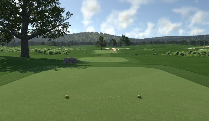
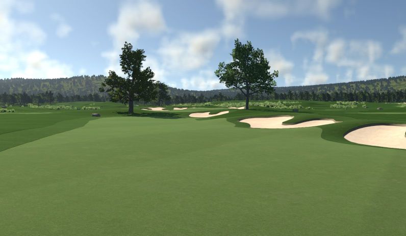
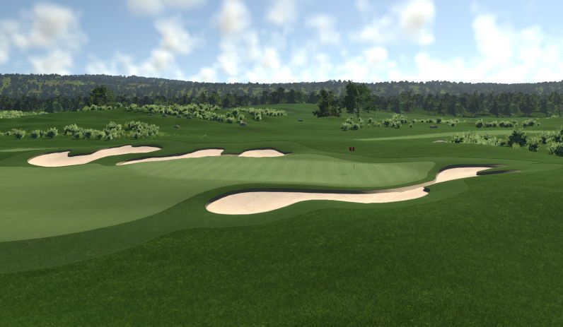
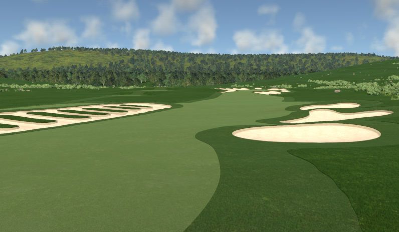
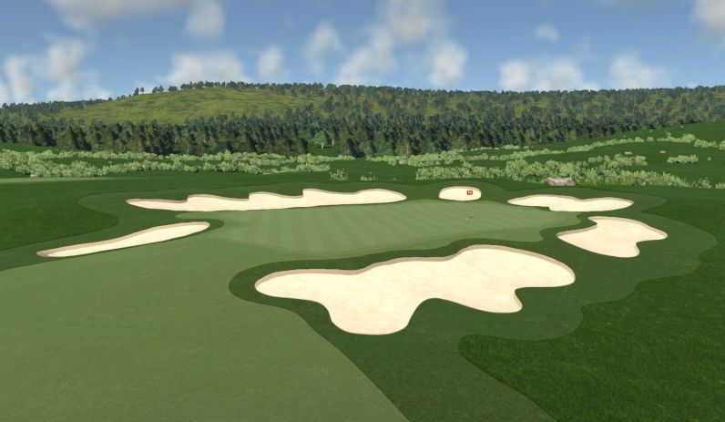
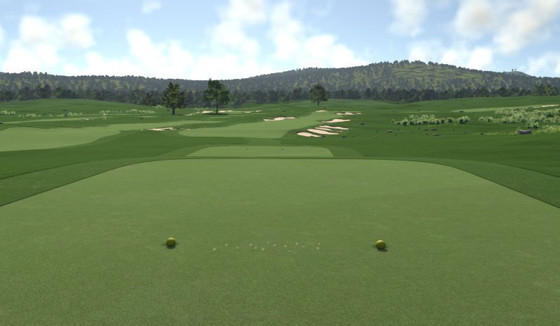
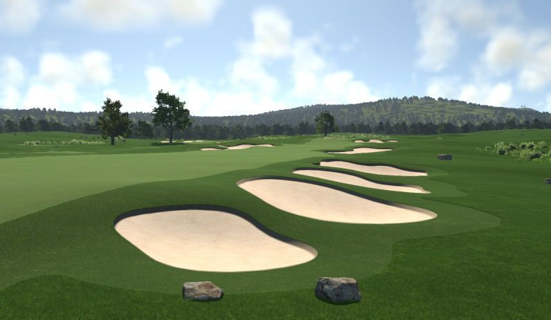
Hey Andy, I'm a new designer as well so take the advice for what it's worth. Looks better than my first attempts by a long shot so please keep going and a warning that course design can be addictive and take over large chunks of your life.  I'm a big fan of the rural theme so have fun with this one. I'm not really sure about the plantation you are doing my suggestion would be to continue to experiment with different types of plantation and make it look a bit more rough and weedy with something. It's been a while since I have used the rural but if the grasses have something browner this would be the area to try mixing that in. Great idea though and as with all great ideas less is more. Don't over use it. Your bunkers are looking pretty good nothing that sticks out and says "Huh?" is that possible. (I tend to do this one but I'm reining it in now). I can't really tell if you have sculpted them yet. The only advice I can give you about bunkers at this point is less is more as well. Be wary of pinching the landing zone off the tee too often with bunkers remember you can use something as simple as rough and there is always water and you have yet to put in tree hazards. But overall you shouldn't really have too many holes with what I will call double pinching. On most holes you want to allow relief to one side and let rough do the work. From your pics it's looking like your getting a little heavy handed with the bunkers. Something to think about. Near the end it is important to go through and start paring things down by asking the question is this really necessary to the design look but most importantly how and if it is affecting play. My last bit of advice would be to watch all of Andre's 101 videos in the tips and tricks if you haven't already. Taste and Ddawg are some great resources as well. That being said always remember, It's your course and you want to imprint as much of your vision and style as you can while trying to stay within the confines of the current design standards.(I don't do this very well). Otherwise we end up with a lot of courses that look and feel the same. I wish you the best of luck and look forward to the play test versions and of course the final release. Let me know if I can help in any way, -Mike  |
|
|
|
Post by foolinjection on Mar 25, 2015 20:53:07 GMT -5
Hey Mike,
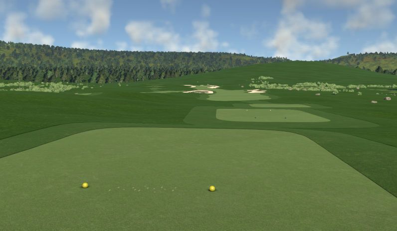
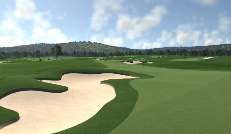
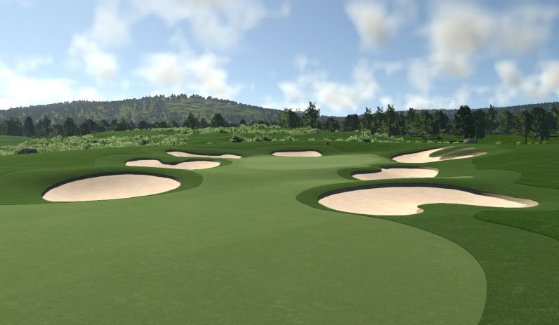
Thanks for the advice. I've been trying to create the course in the style of the kind of course you'd find in the NE U.S.A. So I'm taking inspiration from the likes of Winged Foot, Oakmont, Merion, Shinnecock Hills etc. To that end I'm deliberately making the course kinda bunker heavy like Oakmont and shying away from water. Truth be told I'm actually shying away from water mostly because with it being at a set height level you can't really get it to flow down beside a hole or wind through a course that easily. So I've tried to emulate a creek or a burn with the heavily planted ditches you can see in the pictures. The rural colour scheme is quite vibrant and there isn't much in the way of brown in the plants, closest you can get are the bull-rushes which in a ditch minus the water might look kinda iffy.
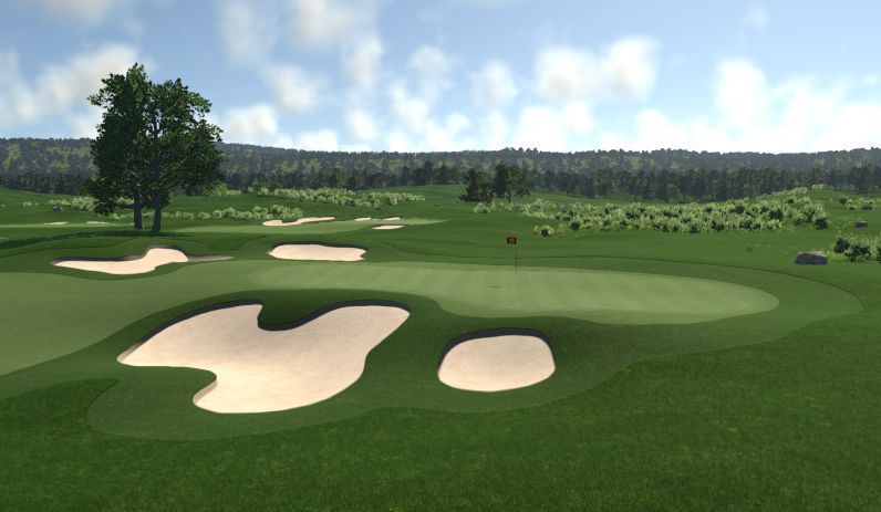
I've tried my level best to sculpt the bunkers. I'm trying to use the Jack Nicklaus 6 methods I learned back in those days with TGC's designer and sometimes it works, sometimes it kinda doesn't but I'm fairly happy with what I've achieved so far. I've watched some of the series that CrazyCanuck has put out and am an avid follower of his Course Critiques on YouTube/Twitch, so I'm kinda getting to know what to try to avoid. DDawg has uploaded some good stuff as well. I'd rather stay away from anything to do with Taste however because reasons. Probably the less said about that the better.
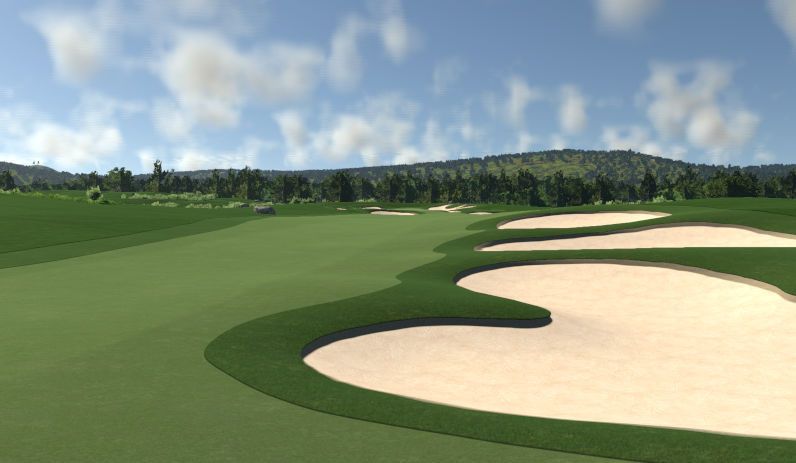
As for the actual design of the holes themselves a lot of them are my takes on holes I've seen on the courses I'm taking inspiration from. I'm no golf architect so I'll probably never design anything to hot myself but I kind of subscribe to the school of thought that golf should be a game of accuracy rather than power and to that end I do use a lot of bunkers to "frame" a landing area. I'm hoping it's not too much, but if the general consensus is that it is, I'll maybe have to re-evaluate that. I haven't even really began to think about proper planting of trees etc yet.
But yeah, thanks again, I'll take that on board. I'm enjoying designing courses, I've kind of stalled out a little though recently, I wasn't on my computer for a few days and it's taking me a little bit to get back into it and regain the train of thought I had. Only just discovered you could go into offline mode and play your unfinished/unpublished course with proper winds as well. Still, 4 holes to go and then I can think about planting and throwing it out there to the general public.
|
|
|
|
Post by joegolferg on Mar 26, 2015 10:56:53 GMT -5
Oakmont does ring a bell when looking at these pics, certainly a style is will try when I'm done with the US Open contest.
|
|
|
|
Post by foolinjection on Mar 30, 2015 8:47:01 GMT -5
|
|
|
|
Post by theclv24 on Mar 30, 2015 10:37:32 GMT -5
I like what you have going on here. Definitely has the US Open feel, a very Oakmont vibe even without the church pews. Based on the screenshots, just two suggestions so far:
1. Add some depth to the bunkers. They are bumped-up well with good sightlines, but the middles look like they need some depth.
2. I would reconsider the theme. I understand the look you are going for with Rural, but the textures are pretty bad. I'm thinking you could get a similar look with Boreal, but use Heavy Rough everywhere there isn't fairway or light rough. You get the same green everywhere, no brown, and better textures. Not sure if you have played it, but think of Dewdrop Golf Club. That's the type of look I envision here, but less trees.
|
|
|
|
Post by foolinjection on Mar 30, 2015 11:12:20 GMT -5
I like what you have going on here. Definitely has the US Open feel, a very Oakmont vibe even without the church pews. Based on the screenshots, just two suggestions so far: 1. Add some depth to the bunkers. They are bumped-up well with good sightlines, but the middles look like they need some depth. 2. I would reconsider the theme. I understand the look you are going for with Rural, but the textures are pretty bad. I'm thinking you could get a similar look with Boreal, but use Heavy Rough everywhere there isn't fairway or light rough. You get the same green everywhere, no brown, and better textures. Not sure if you have played it, but think of Dewdrop Golf Club. That's the type of look I envision here, but less trees. You're right about the bunkers. It's even worse on the front 9 where I had even less idea what I was doing. It's something I've been going back over and looking into. Like you said I seem to be able to get them into the landscape okay but they are a little flat. I've been thinking about the theme as well. My only issue with the other themes is the lack of proper white sand. Boreal, Counrtyside and the new Harvest theme are great for texture blending etc... but the sand is a more earthy brown. Once the planting bug in the GNCD is fixed I'll hopefully be able to muck about with this a little more. I think you might be right regarding Boreal, I was even contemplating Harvest as well. With the current planting bug though any grass I've put down I can't edit till the fix is applied. So it's hard just now to mess about when you can't delete anything but trees. |
|
|
|
Post by foolinjection on Mar 31, 2015 7:37:49 GMT -5
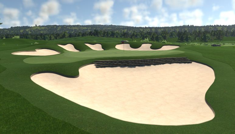
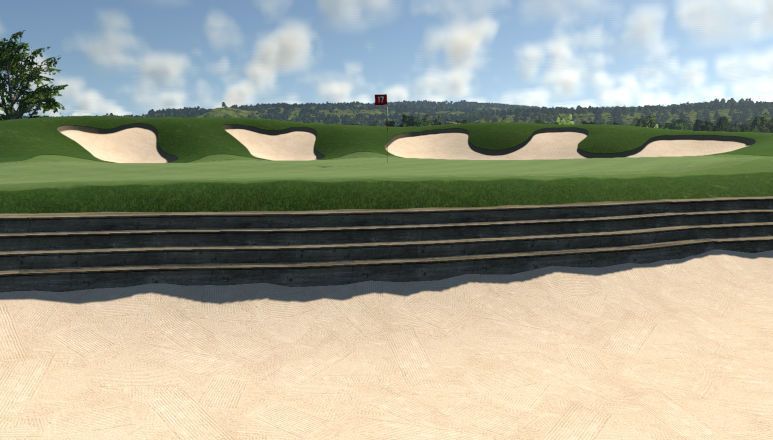
Messing around with the new assets here. Using the wooden stairs here to make it look like the steps are a bolster for the bunker face. Initially had the idea to use the retaining walls for this but then realised they snap to the waterline. As the 17th is pretty high up on a hill, they aren't usable this way. I'd have to lower the entire hole to the waterline. I think this looks pretty cool though. Some planting at either end where the stairs finish and I think it'll make a nice memorable par 3. The only real issue is if you don't give the tee-shot enough "oomph" and you end up right up against the treads of the stairs, you pretty much have to play backwards and then up to the hole. I say it's an "issue", you'd likely have to do that in real life as well.   |
|
|
|
Post by foolinjection on Apr 1, 2015 5:44:51 GMT -5
After much consideration I've decided to change the theme to Boreal. I'll post up some screenshots later on as I'm working on the 18th just now but I think the theme change will pay off. Just a pity I can't have Boreal but with the pure white sand.
|
|
reebdoog
TGCT Design Competition Directors
Posts: 2,742  TGCT Name: Brian Jeffords
Tour: CC-Pro
|
Post by reebdoog on Apr 1, 2015 8:40:07 GMT -5
hint on bunker depth that saves me a lot of time and effort.
1) Bump up the ground around the bunkers, slightly higher on at least one side (usually towards hole or towards hole border...but not always)
2) skip the lowering tools and get lazy for a minute. Take the same shape as the bunker (do this in stages if you have too) and FLATTEN... lower it a little bit if you want before flattening but I suggest flatten and take a look then go lower if you have to. This will instantly give the ground around the bunker some character.
3) NOW grab a SOFT flatten brush and kind of work your way around the bunker a little at a time, inside, outside...right now you're trying to get the ground to flow into the bunker the way you want without having big walls all around it. Generally one side at least is going to be more even to the ground than the rest.
At least give it a try. I think you'll like the results and it's a pretty quick method.
|
|
|
|
Post by foolinjection on Apr 1, 2015 17:29:34 GMT -5
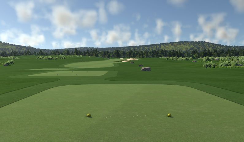
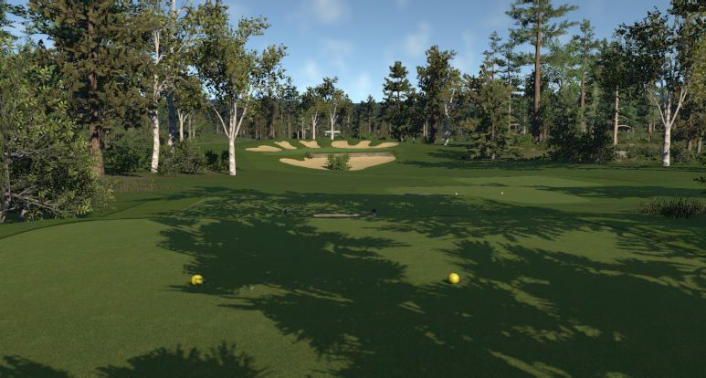
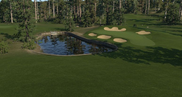
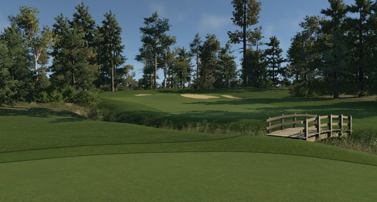
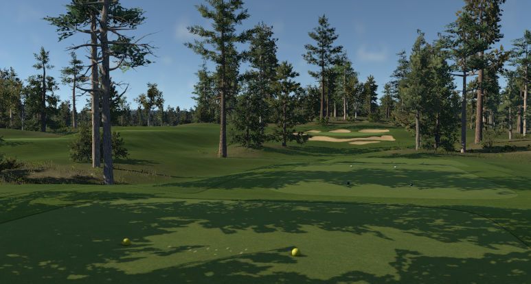
hint on bunker depth that saves me a lot of time and effort. 1) Bump up the ground around the bunkers, slightly higher on at least one side (usually towards hole or towards hole border...but not always) 2) skip the lowering tools and get lazy for a minute. Take the same shape as the bunker (do this in stages if you have too) and FLATTEN... lower it a little bit if you want before flattening but I suggest flatten and take a look then go lower if you have to. This will instantly give the ground around the bunker some character. 3) NOW grab a SOFT flatten brush and kind of work your way around the bunker a little at a time, inside, outside...right now you're trying to get the ground to flow into the bunker the way you want without having big walls all around it. Generally one side at least is going to be more even to the ground than the rest. At least give it a try. I think you'll like the results and it's a pretty quick method. Cool, I'll give this a shot. Thanks for the advice. While I'm mucking about with that, here are a few screenshots of the course in the Boreal Theme with a few trees planted. A screen of the 17th with the wooden stepped bunker wall and a screen of the 18th works in progress. 17th Hole from the Tee  18th Work-in-progress  Couple screens of the 6th Green and 8th Tee respectively.   I think it looks nice in the Boreal theme. Can get some nice long shadows off the trees and the terrain certainly does blend a lot better. |
|
reebdoog
TGCT Design Competition Directors
Posts: 2,742  TGCT Name: Brian Jeffords
Tour: CC-Pro
|
Post by reebdoog on Apr 1, 2015 17:53:30 GMT -5
The texture blending is the primary reason for ignoring the older themes. Links can hold up under the right lighting and planting...but the others are just too drastic in their different textures.
|
|
|
|
Post by foolinjection on Apr 1, 2015 18:05:28 GMT -5
The texture blending is the primary reason for ignoring the older themes. Links can hold up under the right lighting and planting...but the others are just too drastic in their different textures. Yeah, it really is. I just wish I could change the sand texture to something a bit more pristine white and that the Countryside theme had the same kind of tree density as the new Harvest one. |
|
|
|
Post by foolinjection on May 1, 2015 1:57:14 GMT -5
Just a quick update. Course design has been on a bit of hiatus recently as I've been working flat out at this new job. Only had a single day off since the 20th. I've not abandoned TGC completely however. Once my job gets into a proper rota and I know what days off I'm getting etc I'll be able to put some time in and get the course finished.
|
|


