Post by Moe Slorkman on Jul 21, 2016 3:04:10 GMT -5

Web.com Design Contest 2nd Place
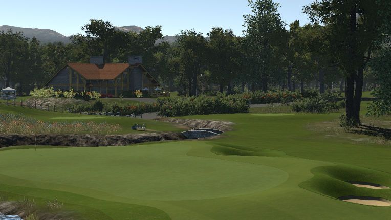
Stisted Hall by Paddy Yates pyates
Highest Individual Placing : 2nd
Pro:
In this game there are not many designers that can create firm and fast courses that play as good as pyates can. This course as always plays like a dream were you forgot your playing firm and fast. Always constantly looking to see how to take advantage of the greens and terrain to plot your way around the course. The routing was excellent having 9 and 18 beside the lake up to the clubhouse was just a great way to finish your round. It was a great test a pleasure to play and very memorable. Using low light settings is a bit of a standard these days to make courses pop. There is none of that on Stisted Hall. Despite that or perhaps because of it, this course looks beautiful. The atmosphere is fantastic and there is a real feeling of authenticity to the course. pyates does many little things real well, that many others does not, such as the right to left tilted fairway on the dogleg right #8 or how he uses the right brushes to create the textures he wants in the heavy rough.
Con:
Patrick isn't the cleanest of designers when it comes to edging of courses granted and lets be fair its an incredibly tricky job and in most cases I would look over it and say its acceptable but the midsection of the 9th and 18th fairways when you zoom out really takes you by surprise. Have you ever brought a very attractive young one back from the club and the next morning you wake up and see an imprint of her face on the pillow then you glance at her face and a feeling of ugggh comes over you? this is what happened when i zoomed out!
at times the feel of the course seemed very confused as it sort of went from new mindset Yates and a fresh look to old Links style yates and pot bunkers. It just took away from the flow here and there.
Lastly the bunkering isn't perfect, but there is nothing wrong with it either. OH and one eagle eye judge noticed there is a small gap in the road on one of the bridges... Does that count as a negative? No we are grasping at straws here really.
Summary: Its an amazing course and a worthy winner on any other day the cons are under normal circumstances mute but on this day it was beaten by a course that just ticked all the boxes IOO. Great job an no shame in coming second!
Web.com Design Contest 3rd Place
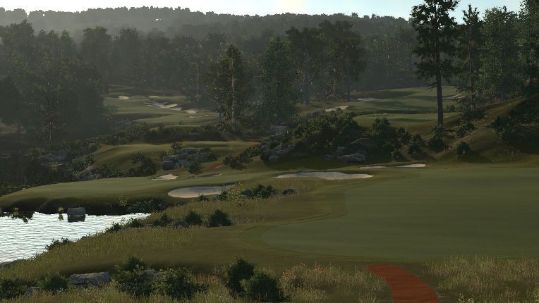
Andilly Hills by Chris Nelson - hershalcrustofsk
Highest Individual Placing : 2nd
Pro:
Andilly Hills starts off with a short, but deceivingly tough par 4 and sets the tone for the front 9. It's firm, it's fast and it can be a pain in the arse, but if you can hold out and take whatever birdies you can muster, you are in good shape for a run back 9. Chris's ever growing library of courses is impressive to say the least and as his portfolio has progressed so has his ability. In its current setup the back 9 provides a bit of a breather, but that can all change when the multi pins get done. Because that's the thing with this course, you can tell right now that this course can play vastly different depending on tees and pins and just by looking the these greens you know there is already a game plan in place to make it happen. This course also features what we believe the best use of elevation of any course in this competition. It uses a lot of them, but it never crosses the line to fantasy territory. It's just perfectly done!
Con:
We found little negatives about this course. If anything we thought there were a few too many approaches that used long irons in and it can get frustrating. That cart path
 . But hey everything looks beter with a bit of colour !! (just not that one
  )
)Summary:
A fantastic course that perhaps put forward the best challenge to the finals. The best "barren" theme in the competition, Andilly does a lot of things right and Chris shows off his skills with the elevation changes here. In the end, it's a great and beautiful challenge, but it just falls shorts in this competition.
Web.com Design Contest 4th Place
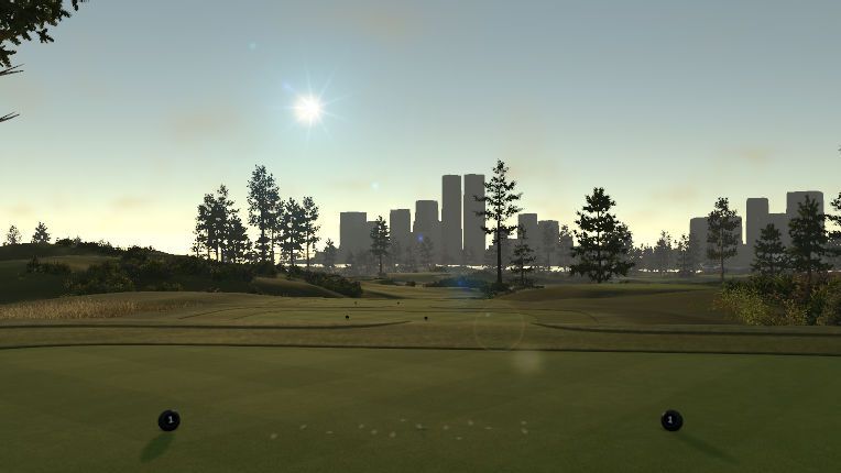
Selke Park Golf Course by Matt Geddes - staypuft39
Highest Individual Placing : 2nd
Pro:
Honestly, this course missing out on a top 3 breaks my heart. Matt is only new to the designer and his development since Stadium creek to Selke Park is outstanding. The course was stunning, the views were amazing and the skyline is IMO the best mounding done by anyone in the game. Technical work all around was spot on. The course played like a dream, tough but fair. In its current set up it's brilliant and on top of that it gave a great test and made you play the terrain dialling in wasn't a option. Smart golf and course management was the order for the day.
Matt there is a tournament with your name on it and I think this course should host it. Week 8 Stay Puft Marshmallow Classic in Web maybe?
Con:
"Moe you sound like your trousers are getting tight, so why isn't this in the top 3?"
The Major downfall had me screaming at the tv when it was pointed out! A lot of the greens slope front to back which makes multipinning a potential issue. The main discussion was if it was multipinned in its current state, would it work? We deemed it would have to use softened set ups which would kill some of the difficulty and would render it unsuitable for the Web Finals. Softening up for a regular stop would be fine but for a finals would lower the difficulty to much we think.
Summary:
Matt your greens were your downfall and we can't judge by the greens you 'could have built'. We loved this course and I had it as an immediate favourite. Excellent course that will get on tour no doubt. Just let me reiterate. In its current set up holding greens is not an issue. It plays great, but trying to get a 4 pin set up while maintaining the difficulty and fairness would be an issue.
Web.com Design Contest 5th Place
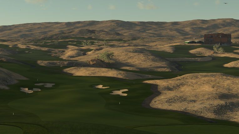
Buzzard's Wake by - Brian Jeffords - reebdoog
Highest Individual Placing : 5th
Pro:
Very few designers can rival Reebdoog when it comes to sculpting and execution in the the designer. He is just a master at presenting a clean well polished course. Buzzard's Wake is no exception and his take on the Desert theme is nothing short of spectacular, with its fairways nestling itself between the well sculpted "hills" and dunes. It's not as minimalistic as Doubtful Dunes, but there isn't much to look at outside of the course. That is however part of what makes this course great as well. Buzzard's Wake gives just gives you good challenging golf all around. It plays fair for the most part, but unlike many other courses this is not a one trick pony as you need to take good care on Drives, Approaches and putts at an equal measure. The tee shots in particular is something for all designers to study. The use of shapes and elevation changes creates a game of deception and illusion. That together with searching for the best lie creates more than a few head scratches for this Judging crew.
Con:
There really is very little if anything at all to complain about on Buzzard's Wake. Even less so than some of the courses placed further up the list. So why 5th? All judges had different reasons why they didn't place this course higher up. Most of them were about gut feelings and personal preferences. We felt it didn't stick out as much as some of the other courses and that it left us wanting something more. One judge wondered though if this course had been tested properly in wind, as he felt that on many occasions there were no good spots to place your drive presented with head and tail winds. In little or east/west winds the course played wonderfully but in head and tail wind finding a good spot to put the ball could get very difficult. This could be an indication that more testing in wind could have been profitable. It could also be an entirely wrong assumption.
Summary:
Buzzard's wake is a fantastic golf course that ticks all the boxes for a tournament course. Technically this course is flawless, but it didn't bring as much enjoyment as the courses still to be announced. This is a course that will definitely be on tour. Just not the Web.com finals.
(Please PM all complaints to me, I might answer you)
Web.com Design Contest 6th Place
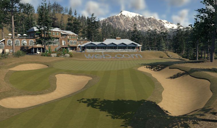
Hopper's Valley by - Sam Morris - SAM
Highest Individual Placing : 5th
Pro:
What a fantastic setting for a Golf Course. Beautiful backdrops, thrilling elevation changes, absurdly good (and time consuming) planting are all small components that make this course stand out. (The Par 5 15th with the valley overlook and the grazing deer is particularly lovely). Oh by the way, the golf here is pretty good too. Elevation changes galore here will make you rethink your club selection (or at least it should) off the drive and on the approach. Everything is cleanly presented, if not a little outlandish. The rough and deep rough are cleanly presented, the fairways and greens are accessible and the bunkers are where you expect them to be and most are nicely sculpted. The routing itself has some imagination to it although if you're paying attention you shouldn't have too much trouble.
Con:
Unfortunately, what works for this course is also what brings about it's downfall. The fact that it's played on a mountain means that the fairway has some steep drops to it that on occasion can border on unrealistic. It would be unfair to say that the sculpting here is off because in order to make a course with severe elevation changes, you have to be a strong sculptor. However, there were some areas that could have had more time and attention paid to them. Additionally, some of the bunkers looked a little rougher than usual and while the planting here was imaginative, a judge or two felt that it was crossing a line into being overplanted.
Summary:
This is a pretty, pretty course in an outstanding environment. In fact, it is arguably the best setting in the competition. However, when it gets to this point of the list, it all comes down to nitpicking and this course just wasn't executed as well as those that will come above it.
(Please PM all complaints to me, I might answer you)
Web.com Design Contest 7th Place
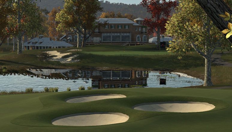
Dehesas Pristinas by Pablo Alonso - pablo
Highest Individual Placing : 3rd
Pro:
The best thing about Dehesas is something most TGC players won't ever experience. This course gets better for each time you play it.
The way this game works with all the fantastic courses out there is that we play a course once and we move on. It's a real shame to begin with, but that also means that courses like Dehesas won't get the full credit it deserves unless it gets put on tour. It looks like a real course and feels like a real course even if it does have some minor flaws aesthetically. The greens were excellent in its firm setting yet still not too much for the average golfer to handle. Good scores can most definitely be found here but you really need to be careful not to get caught on the greens as a miss hit could be disastrous. Oh... nice work on the retaining walls by the way. We had a blast playing here.
Con:
It's true that finding flaws in the courses in this competition has been a challenge on its own and it doesn't get easier the further up we go, but there are a few areas where this course could be improved. Mostly with planting and the crooked / tilted cart paths. If you add something make it right and the cart paths could have used some more attention and we felt the Web.com logo could have needed some more attention as well. Another thing that was mentioned was the fairway on #1. Why was there a tree in front of the fairway and why was that fairway the obvious pick from the tee on #9? These negatives are all about looks and presentation and that is what it comes down to. Does this course contain the best holes and the best greens in the competition or is it the best one in terms of play-ability? No. It's not, but there is nothing to complain about in those aspects either.
Summary:
We won't lie. We were split on this course as you can see it was ranked as high as 3rd by one judge, but still only end up in 7th. We all agree though that this course was real fun with and very well done overall. Just make sure to hand out helmets in the club house because we will use that #1 fairway more than once and the tee shot is blind.
(Please PM all complaints to Seth he might answer you )
Web.com Design Contest 8th Place
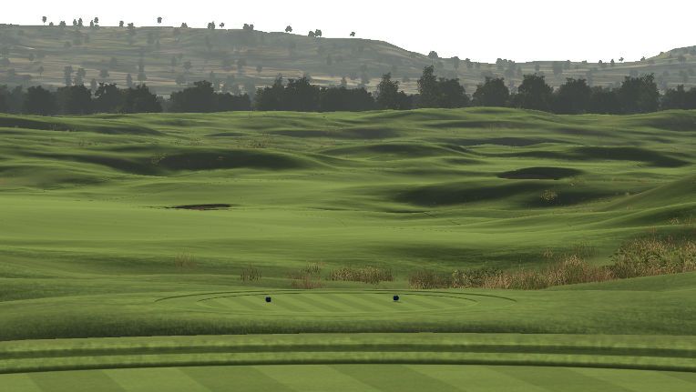
Doubtful Dunes Golf Club by Griffin Ray - DoubtfulObelisk
Highest Individual Placing : 8th
Pro:
I (Moe) have played Griffins older course's and yeah they have been well horrible and to be honest. DO will tell you that himself so when i loaded this up one the first tee I said this is the best course he has designed and as I played the course my original thoughts were confirmed. If minimalism is your thing then you need not wait for the other 7 on this list. What we have to look at around this course apart from grass and golf holes is a gazebo, a club house, a tree, a heli pad and a couple of toilets.
That said though... Wow. The nothingness that surrounds this golf course is spectacular. The rolling grass-hills seamlessly flows through the landscape and you truly get a feeling of loneliness when playing this course. In a good way. That there is a lot of talk about nothing, but what else is there to comment on here? Well we course plays like a dream. Good variation of shots with some nice subtle elevation changes and you get to use all the clubs in the bag to get around here. We also commend the use of blind shots that really work. The green complexes are very well done and care needs to be taken on your approach.
Mrooola deemed #18 on Doubtful Dunes to be the best finishing hole in the competition.
Con:
So the course looks good and plays really well. Why does this course not have a higher spot on the list than 8th? Well most of it comes down to the challenge of the course. We think that Griffin missed the mark here by the width of a Doubtful Canyon and after some discussions we found that upping the firmness would not be suitable here either. Not only would it ruin much of what makes this course good, but many of the greens would probably need to be redone to work and that would essentially create a totally different course. Which wouldn't be the course we are judging in this competition.
Summary:
So it boils down to that this course sadly entered the wrong competition. Had this been about creating a good golf course at any level it would fair real well, but this is a competition specifically for the Web.com finals and difficulty was in the description for good or for bad. I do hope to see this course on some tour, be it the CC-Tour, Speed golf or any other of the many tours and events we have around in this community. It really is deserving.
(Please PM all complaints to Seth he might answer you )
Web.com Design Contest 9th Place
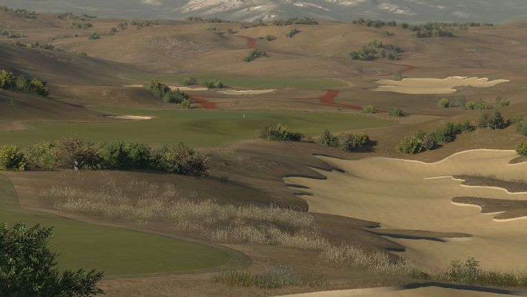
Westering Home by adamhill413
Highest Individual Placing : 8th
Pro:
Technical aspect of the course was on point. The Sculpting of the full plot was excellent and the course played like a dream. Planting although minimalist was very well executed and the course put up a really good challenge. The wide fairways were a plus on this course as it lets the golfer make real decisions on where to put the ball to get the best angle towards the green which is important around here. Another Tour Stop for one of the tours I would hope.
Con:
This is another excellent designed course by Adam, but it just seemed very safe. All that was done was done to a high standard, but the course just left me wanting more. Best way to explain it as worded by Moe "You know that feeling you get after watching a Coen Brothers movie like No Country For Old Men or Burn After Reading?" We'll that's how we felt. It was excellent start to finish but left you thinking; What else could be done to make it spectacular? "Also the choice of Surfaces had me thinking Grizzly bear Orgy for some reason" Moe added (must be the new meds).
On a more direct note we think the course would have been better in firm conditions. All greens seems to be designed for firm as they reminded us very much of Adam's Olympic entry. Firming it up wouldn't make too much of a difference to the toughness of the course, but we think it would make the contours of the green play better.
Summary:
Adam is known for his tough and super punishing courses, but this one does not entirely fall in to that category. This is accessible on most skill levels and a quality course overall that needs a home on on of the tours. It just needs some dancing penguins or something to bring it to life. As per usual been hyper critical here.
(Please PM all complaints to Seth he might answer you )
Web.com Design Contest 10th Place
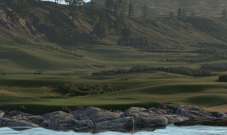
Kentash Bay (187 Firm) by Ken Wise - coggin66
Highest Individual Placing : 10th
Pro:
The environment here is excellent and the view of the first tee is quality with the added fact you've no Idea were to aim. The course was very clean and tidy throughout. It played nicely and tough. The Firm 187 for the most part played fair and as a whole the course was very good.
We Really liked the rock formation behind three and thought that the routing was done very well too.
Con:
The positives of the course also lead to the negatives this courses as per all our notes was well finished well routed a good challenge and a tour quality course no doubt. But apart from the first tee shot the course didn't really stand out (links style can do this). Everything about it was very good just wasn't a course we were jumping up and down about.
Been ultra nit picky some of the sculpting didn't look realistic and just a few bunkers were unusually sculpted as well.
Summary:
Very good solid consistent course only advice I would give is try to make it more interesting which is tough with links granted but that was really the only fault with the course is it didn't grab us by the balls and scream top 3 course.
(Please PM all complaints to Seth he might answer you )
Web.com Design Contest 11th Place
Totem Creek G.C. by Anthony Martin - Chief Banks
Highest Individual Placing : 8th
Pro:
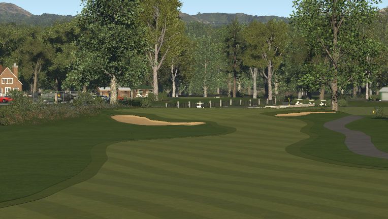
Firstly if there was a prize for the best clubhouse area right here is your winner hands down! The course played well in general and put up a decent test. The layout is excellent and the view off the tee leaves little to complain about. There are some clever use of blind shots and that's the second course to do so without compromising the look and feel of the course or ruin the experience for anyone who decides to play with no aids.
Con:
There are some questionable design choices when it comes to fairways that are cut off or bunkers that are placed on or around the fairway without a proper band of rough around it. This leads to a course that looks sloppy and unfinished. Some greens (only a couple) played a bit mean with the shots you would be left in.
One other very small thing when putting in a retaining wall I highly recommend using the smallest length and putting more in it gives the curve of the wall a more polished look.
Summary:
A fantastic environment, beautiful to look at but we didn't think it held up execution wise. On future builds please take better care of the rough around the bunker edges as these were the stand out fault with this course but this again could make its way onto a tour with a little more care IOO.
(Please PM all complaints to Seth he might answer you )
Web.com Design Contest 12th Place
Royal Castlerock Links by Mitch Kiser - welikeitroughnc
Highest Individual Placing : 11th
Pro:
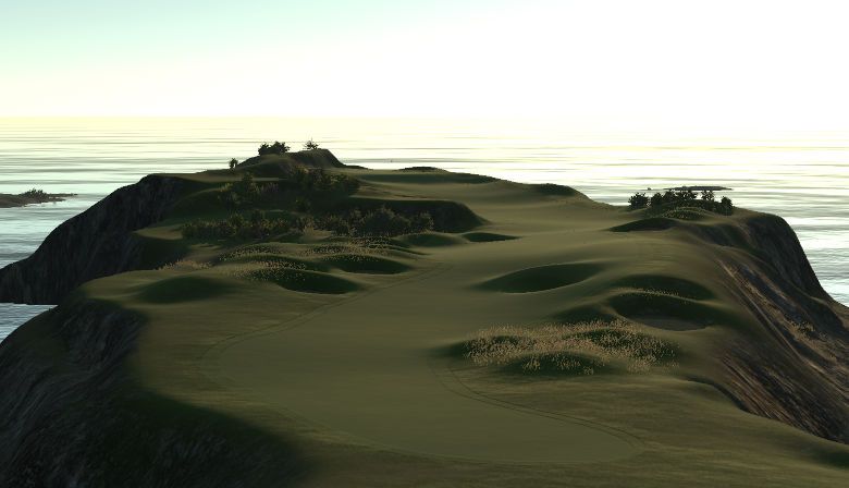
This Links style course looks amazing and the hole design keeps you interested and on your toes at all times. The bunkers look real sharp and if you want to score on this course you best stay out of them as they are deep and will punish anyone who goes in them. If you can manage to stay out of them this course is out for the taking as the greens produce room to navigate the ball near or around the pin on most approaches. The sculpting of the holes was also done real well creating interesting tee shots and views. Just watch out for the texture tears. We think this course could handle a firmer setup and even if the judging is done on the setup at hand we have added it here as an observation.
Con:
While the overall look of this course was one of its most major selling points it's also the reason for its biggest downside. If a hole is not along the coast, its headed towards the sun, creating fantastic views, but also potential problems in terms of wind. This also removes some of the realism of the course to make it excel to a higher position on this list. Some may not notice, but playing along the coastline having the ocean to your left on 4 holes and then suddenly on the 5th you have the ocean on the right to only flip back again on 6 could produce a system error in anyone's brain.
Summary:
A fantastic looking course that plays a little on the easy side depending on the wind direction. It lacks some realism in the layout and hole routing, but produce a very enjoyable round a Golf when all things are said and done. Thats what this is all about in the end now isn't it?
(Please PM all complaints to Seth he might answer you )
Web.com Design Contest 13th Place
Nugget National Golf Club by Sam Boyns - boynsy
Highest Individual Placing : 9th
Pro:
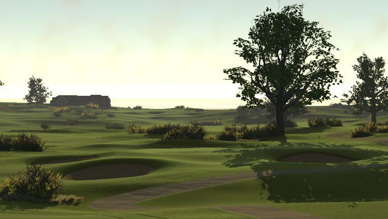
Going for Links was a risk with highlands been available and his balls to do this has to be commend. The course as a hole with the lighting routing and clean views and planting made you forget this was an prehistoric theme. The course was a good challenge and played very well for the most part. The bunkers surrounded with the natural terrain was real sharp and the wooden wall effect using steps was a nice touch.
Con:
When we played this course to do the judging we found 8 pins on yellow slopes and 1 on red. This made half the greens very unfair and killed much of the enjoyment of the round. The frustration with this is this course could have been destined for a spot a little further up the list. Now, for the record we all play on PS4. Or at least we used to. I just got my PC and decided to record a playthrough giving some feedback of the course this morning and I found just 4 pins that was near yellow and would not call them unfair. This course simply does not play the same on PC and PS4. I have no idea what affects this discrepancy, but sadly it did affect the judging of the course. The other issues was consistency of bunkers some minor sculpting around the edges of some greens. Finally with the small greens in places multipinning could be tough (this was a observation but didn't affect the marking).
Summary:
This course with a few tweeks could surely get on tour if the reason for the PC, PS4 discrepancy when talking about the pins get sorted. Perhaps try and release a different version in a different theme or try and get HB to take a look at it. A job well done here overall and placing this in 13th once again shows just how superb all of the courses in this competition has been.
(Please PM all complaints to Seth he might answer you)
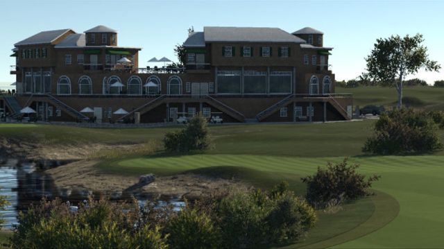
Web.com Design Contest 14th Place
Three Sisters Island GC by Graham Brown - Hootbleet
Highest Individual Placing : 10th
Pro:
There is good use of elevation and you can sense that a lot of thought has gone in to the course and the layout. The higher parts of the course created an excellent view. It was enjoyable as a whole. Sure it was a bit "Fantasy" & "Wacky" but there is nothing wrong with that. The course gave a reasonable challenge and kept you thinking from start to finish.
Con:
There are some sculpting issues around the course and its surroundings and the general finish of the course does make it feel a bit unpolished. From a realism stand point, climbing gear and/or a chopper would be needed to get around the course and a safety helmet for all golfers is recommended. A couple of greens sloped front to back where you had a long Iron in with no landing area, so holding the green isn't always an option.
Summary:
Enjoyable course that shows some great imagination. All the negatives are very nit picky as will be the cases for all the courses such is the standard been set in this competition.
(Please PM all complaints to Seth he might answer you )
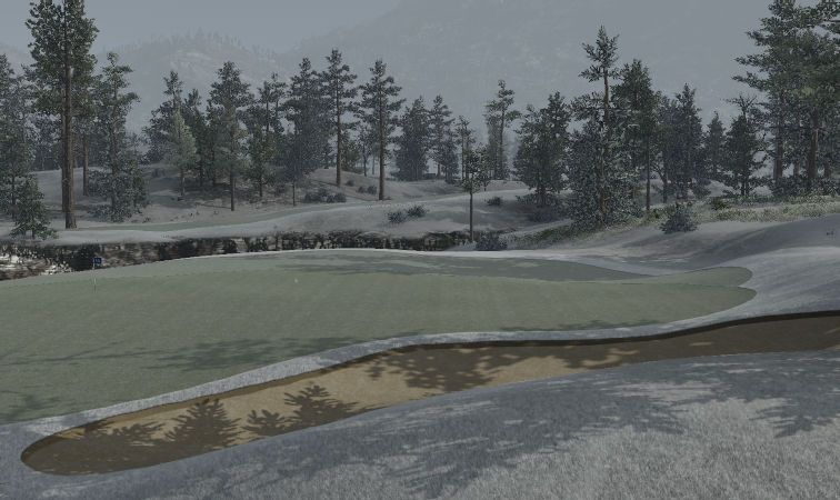
Web.com Design Contest 15th Place
Gordie Golf and Hockey Club by Irving R. Levine - Irving R. Levine
Highest Individual Placing : 13th
Pro:
Errmm ............ *cough emmmm it had 18 holes and yeah one green area was in the shape of a 9 suppose that's worth something!
No but seriously the good side of the course is thought was needed off the tee due to the angles of certain fairways and the hazards that lay around the course. The greens represented a good challenge and you had to pick out landing areas due to the contouring. Some holes added in nice risk reward factors and gave an ample bail out for any chicken balls amongst us. In general the course was fun and enjoyable and kept you switched on from start to finish. Nearly forgot the name nice to see Irving stepping out of his comfort zone and not naming a course after a dead musician.
Con:
As this is a Levine course this is always bound to be longer so here goes *clears throat* Fairways were to straight and unnatural looking, bunkers needed deepening and smoothing threw out, original
Summary:
Another Levine course to be forgotten very quickly ............ Seriously wasn't your best (that's Mia Memorial IMO) Irving but was a solid course.
(Please PM all complaints to Seth he might answer you )
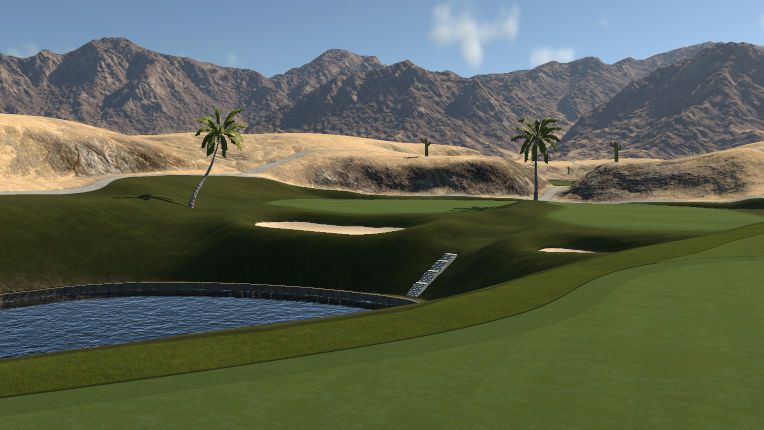
Web.com Design Contest 16th Place
Lonely Light Oasis GC by James Low - phoenixjay
Highest Individual Placing : 15th
Pro:
To say this was the worst courses speaks more about the quality of all the courses rather than the lack of on this course. It played well and gave a decent challenge the routing was very good and the Technisee yoused in the laying of the course and sculpting was fine. The back story and boy do I love a backstory was excellent. And who doesn't love a lighthouse in a desert!!!! (I had 4 on Sand Quentin sure).
Con:
Where the course got knocked down was the fairways you could land a plane on and greens were very easy to access from any angle which leads to make the course very easy with these combinations. As the shots then become rather automatic it can lead to an almost auto pilot trans while playing it. The planting was hap hazard and seemed rushed and incomplete. Desert is a nightmare to make appealing granted but still this aspect was not up to scratch.
Summary:
A solid effort but in the meta it was an average course and in this comp with the designers competing it just didn't stack up

(Please PM all complaints to Seth he might answer you )


